

The 1952 Topps card #311 — Mickey Mantle. The image is already in your mind as you read this.
You know the story: What has become one of the most iconic cards in the hobby started out as the kitchen table creation of Sy Berger and cartoonist, author and “Cardfather” Woody Gelman.
Mantle was almost an afterthought in the 1952 Topps set. It wasn’t until the late-season release of the final series of cards that Mickey Mantle’s picture was included.
You also know the story of how no one seemingly wanted the final series of cards so late in the baseball season. The high-number cases sat for years in the Topps Brooklyn warehouse. Sometime around 1960, Sy Berger decided it was time to clear out the warehouse of product that was taking up valuable space and loaded a reported 400 to 500 1952 Topps high-number cases onto a garbage scowl to be dumped in New York's East River.
But did you know there are two distinct versions of the ‘52 Topps Mantle card?
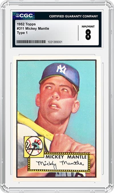
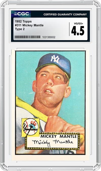
If you remember back from the “old days” of the hobby, the price guides would list the Mantle card with a "DP" next to it. It means double print and that indicates there are exactly double the number of Mantle cards printed in comparison to other cards in the set.
1952 Topps series were printed on sheets of 100 cards. When a series checklist equaled less than 100 card designs, the best way to minimize printing waste was to fill the gaps with duplicate card designs. In the case of the ’52 high series, one of the cards duplicated was card #311.
But 1952 was long before Photoshop or any other type of graphic design software. Card designs were made manually, cutting design devices by hand and pasting them together. While we can drag and drop a duplicate image today, in 1952, a duplicate had to be created almost from scratch. We can see evidence of this manual design creation by looking at the Mantle card.
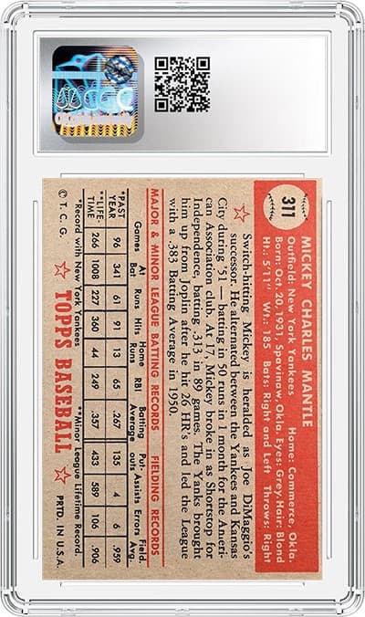
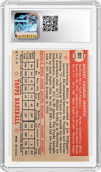
CSG has decided to notate the two versions of the 1952 Mantle card by designating the two versions as “Type 1” and “Type 2.”
So, how can you tell the difference between a Type 1 and a Type 2? Here are key areas of the card to look at to determine the type:
Key Differences Between Type 1 and Type 2 Cards
Design Element | Type 1 | Type 2 |
|---|---|---|
“Mantle” in signature on front | End of 'e' curves upward | End of 'e' does not curve upward |
Box around Yankees logo on front | Solid black border on all sides | Missing black border at the bottom |
"Star box" above name on front | Solid border around the top | Jagged border around the top |
Black box near edge of card on the front | Rounded corner at bottom left due to missing “pixel” | Square corner at bottom left (no missing pixel) |
Baseball on the back | Stiches point left | Stiches point right and are bolder than Type 1 |
The word "DiMaggio's" on the back | The 's' lines up with the 'h' of the word "Right" above it | The 's' lines up with the 't' of the word "Right" above it |
To see these differences illustrated and to learn more about this epic card, click on the video link below.
Note: At the time these cards were graded, they were encapsulated with a different label. Starting July 11, 2023, CGC began encapsulating cards with the new CGC label. In addition to the new label, card collectors enjoy many other benefits with CGC, such as the ability to submit without purchasing a membership and an industry-standard Gem Mint 10 grading scale. For more information, go here.
Related Links